
Case 01 · Fuel app
Kurohudas
A fuel-price app I spent four years on, the lessons it cost, and the agent team that now runs it so no lesson is paid for twice.

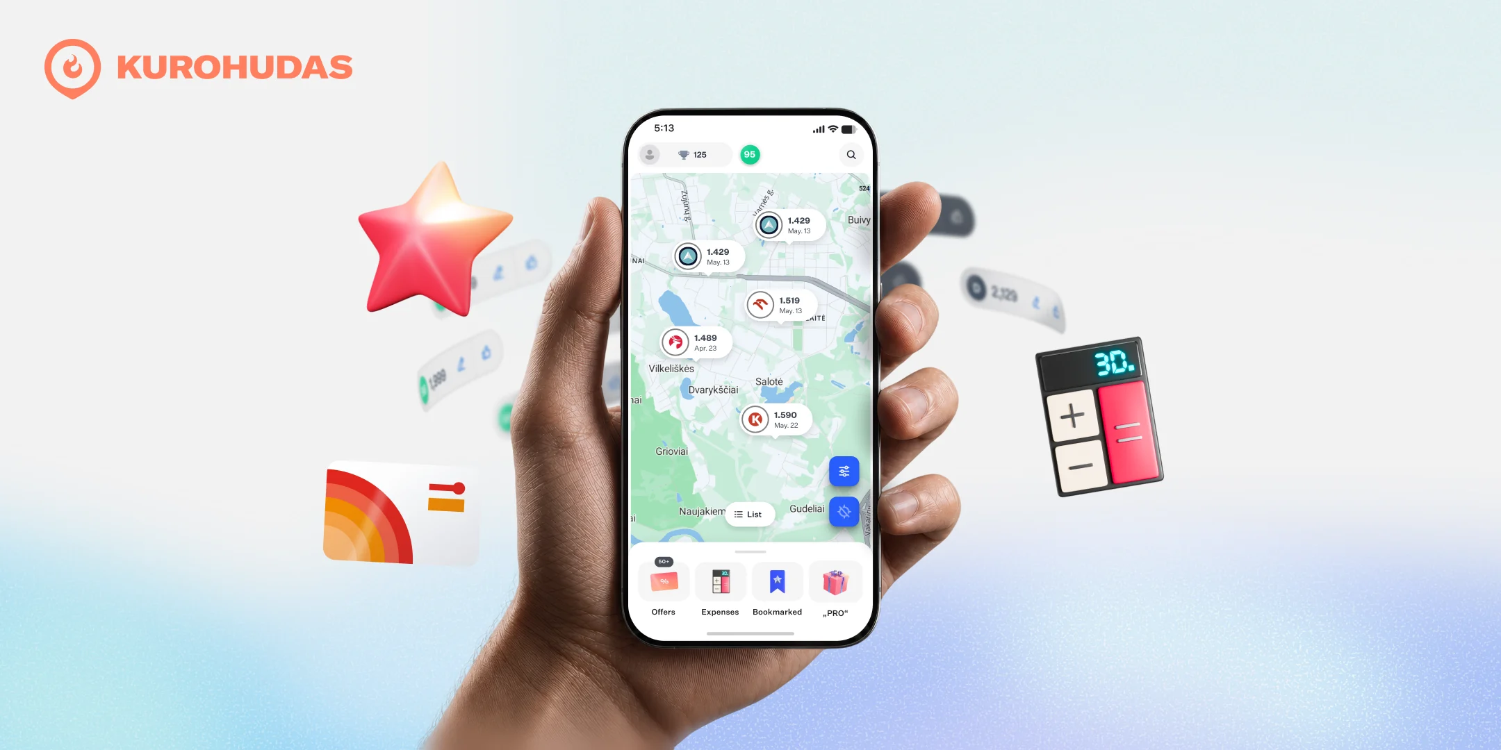
TL;DR
- The most iterative project I have built. Four years, and countless redesigns.
- 100,000 monthly users, grown with no VC, on two engines: UX and SEO.
- Data can be crowdsourced. A gamified loop turns drivers into the data source, and 1,494 keep it live every month.
- Waze-level update volume on fuel prices, fully bootstrapped.
- User feedback and well-set constraints beat countless features. AI makes building more possible. Building less still wins, so we test demand first.
- Fix one real thing at a time. Watching someone use it beats any amount of quantitative data.
- Good UI can cover a product's flaws. Gamification can too, until it bites back.
- Agents now run the daily loops. I write the brief, make the calls, and still watch real users.
A 25-cent problem
Lithuania had no way to see fuel prices. We learned this driving from the coast to Vilnius, when we noticed a highway station and a city one differed by as much as 15 cents a litre. Between cities the gap ran to 25. Surely someone had built an app for this? Nobody had. Aside from Waze, Lithuania had no real fuel-price app, nothing like the US where you check every station before you pull in.
So we decided to build it. That is where the rabbit hole opened, because the hard part is not the map or the layout. It is the uncertainty of the information itself. How do you show a fuel price a stranger can actually trust?
Building more is less
Once we started, the ideas would not stop. Price per litre, a fuel-tank view, premium grades, a trip planner. We built them all. Then reality slapped us: building more is actually less. Working with no feedback and no constraints is a recipe for disaster.
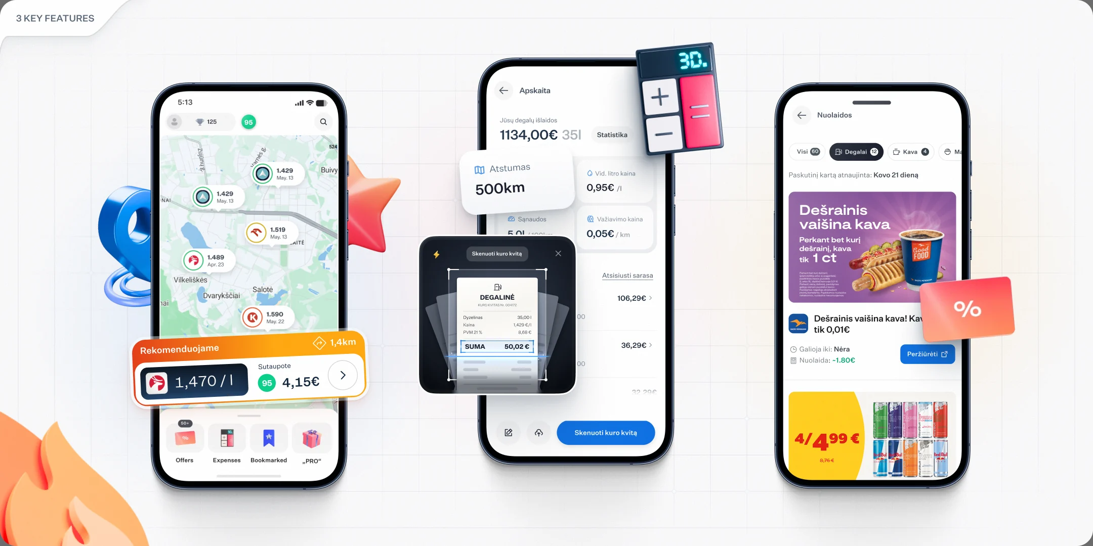
After we got stuck and saw the product was not growing, we built a community to give us the feedback we were missing, and the suggestions poured in. People are more generous than you expect. But that became its own trap. A hundred suggestions is a hundred routes to decision fatigue. As an example, we added a button that showed how fresh a station's price was, and it cluttered the home screen. A few interviews showed it was not intuitive to most people, and the data agreed: it moved nothing. So take every suggestion with a grain of salt. Always ask the user why, dig deeper, and run more interviews. Building the right thing is often counterintuitive and takes real patience, even when it costs more time.
Now, building more is an option. AI lets a small team ship a hundred features. That changes nothing if none of them has real demand, so building less is still better, and we test demand with mini-MVPs instead. Car listings went out as a thin slice: listings and a paid boost. On day one we sent an intro email to some users, and a seller bought a €5 boost. Real demand, proven for the price of a thin slice.
Put it in their hands
So how do you choose what to build? The simplest filter I know: how often a problem shows up, and how much solving it actually helps. The best signal is not a survey. It is putting the product in someone's hands and watching. The moment they touch the app, every assumption you were holding breaks.
People have their own habits and rarely take the path you designed. Your job is not to correct them, it is to make the experience hold up whichever way they go. A single interview surfaces the glaring, low-hanging problems in minutes, and those are usually cheap, so fix them first. The issues that repeat across sessions are the ones worth building around. And the ones that do the real damage are often the ones you never catch in the data or a Hotjar session. Visible problems get noticed and fixed, so the product survives them. The invisible ones are the real product killers.
Now, AI makes limited testing possible. A critic agent walks each design as a persona, with a fresh context and none of the designer's reasoning. It catches a lot, and it still misses people. Discounts are the clearest case. Neither we nor the AI critics caught that most drivers want to see a station's posted price first and the discount second, even when the discounted station is the cheapest. Synthetic agreement is not a participant, so we still put it in their hands.
Why trust a stranger's price?
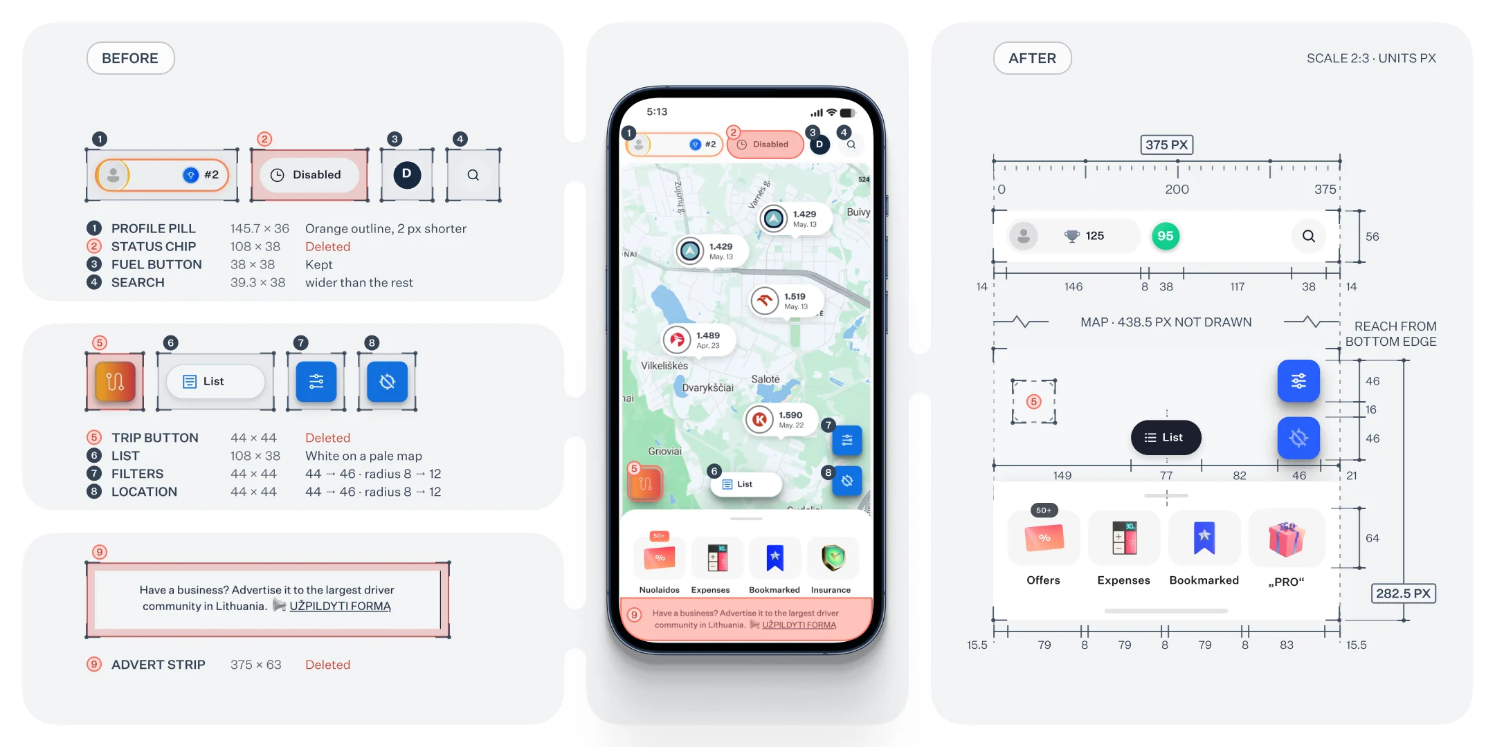
Less is more, and UI is where it pays off. Every visual update we shipped quietly bought back some of the trust our price inaccuracy kept costing us. Most teams treat UI as decoration. It is one of the strongest tools you have for negating a product's flaws. I judge a screen on three things: visual hierarchy, reachability, and cleanliness, meaning how few elements fight for attention.
"Less is more" is the most misunderstood phrase in design, because you cannot know what to cut until you have built enough to see what matters. So you iterate, and you test every change rather than trust your taste. Colour proves it: use it sparingly, tie every use to a goal. We once let weak contrast bury the filters button, and users never found it. Fixing the contrast raised filter usage, and since some filters are paid, subscriptions followed.
Trust also needs fresh prices. The stations would not give them to us, so the drivers had to. Getting people to act turned out to be easy. Add a leaderboard, right? Not quite. We let anyone confirm or update a price for points, and fought to keep that flow short, because every extra step is a reason to quit. Then came impact: "your change was viewed by 21,250." It sounds cheesy. It works. We went from 150 drivers updating prices to 500.
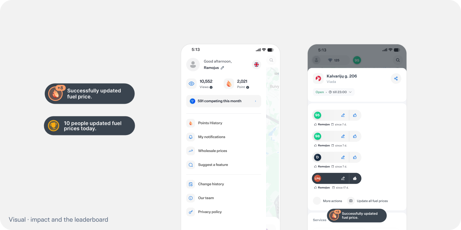
But impact is power, and power invites cheaters. People game points they can never cash in, because they grow attached to a product. It is the strangest user behaviour I have ever watched, and a permanent tax on any system like this.
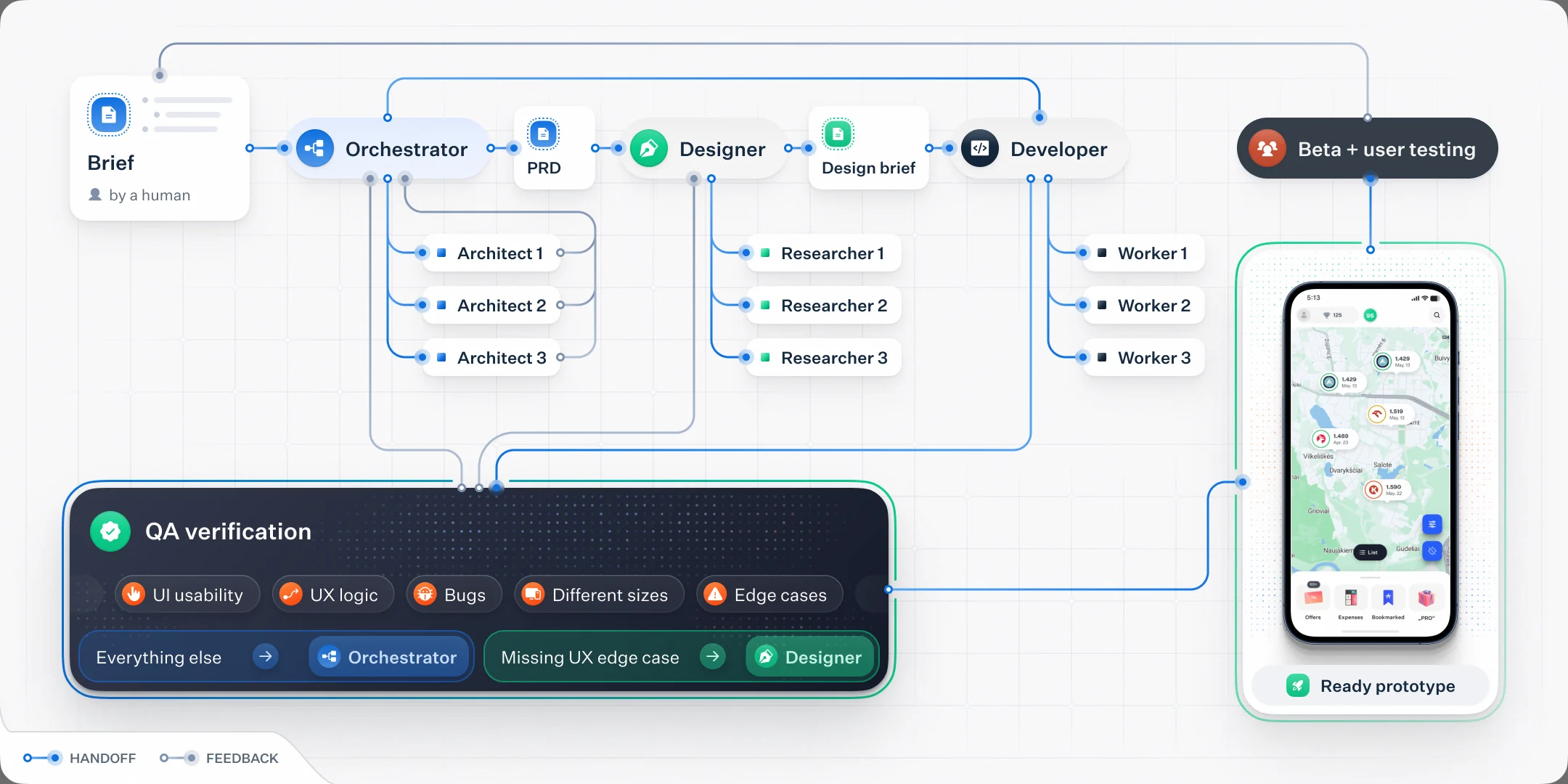
Now, every release passes a QA gate before it ships. It checks usability, the UX logic, every screen size and the edge cases, so fewer flaws reach drivers for the UI to cover.
One codebase, no ad budget
One decision at the very start paid off more than any feature. We picked a tech stack that let the same product run as both a website and a mobile app, on one codebase, so every improvement compounds across both. That is the quiet reason we never spent a cent acquiring users. SEO is a genuine superpower: it scales a product while you sleep, and it is how we reached over 100,000 monthly users with no ad budget and no investors. How we do it stays in-house.
No lesson paid for twice
Four years taught us some lessons more than once, and each one cost time, money or users. So the product now runs on an agent team built around one rule: no lesson is paid for twice.
The work runs in loops, one for each part of the system: production errors, dependencies, speed, the path from first visit to paying user, support and social. Each turn reads a fixed checklist, fixes the worst row a change can move, and writes down the rule that row taught. The next turn starts from a sharper rule, not the same mistake.
Every change passes the same roles. An orchestrator splits the work, an architect shapes it, workers build it, a verifier checks the code, QA checks the screens, and a separate critic, who never saw our reasoning, walks it as a driver. My job is the part agents cannot own: the brief, the trade-offs, and the call to release.
The setup, measured, and its limits
Every role runs on the model its job needs, as of November 2026. Architecture and review get the strongest model at high effort. Mechanical edits go to small, fast models, up to ten at once. That split came from watching, not guessing: the strongest model kept typing one-line edits and burned through our usage for nothing. The opposite fails too. A small model once moved a label 42 pixels instead of 14. And an agent that already knows the work answers in 30 to 75 seconds, where a fresh one takes three to eight minutes.
The biggest lesson was mine. Our Lithuanian copy came back full of anglicisms, and the model was not the main reason. I had handed the writer an English meaning to translate, not the screen, the reader and what was true. An agent writes from the context it gets.
The limits are real. Knowledge dies with a session unless it is written to files. Long sessions get summarised and lose detail. Agents follow rules literally, so the rules have to be good. And a few agents with browsers once filled 27 GB of memory.
Agents do not replace judgement. They multiply whatever process you give them. Give them none, and you ship slop faster.
Slow is smooth, smooth is fast
What this project taught me is persistence and patience. There is a phrase in racing: slow is smooth, and smooth is fast. Building a product is no different. Car listings are the proof, and the fastest thing we have ever shipped. The full plan was eight features and about 35 working days. We picked the one slice that tests demand and shipped it in four days. We were fast because we were deliberate, not because we cooked a thousand features. Agents make building cheap, so choosing what to build is now the whole job.
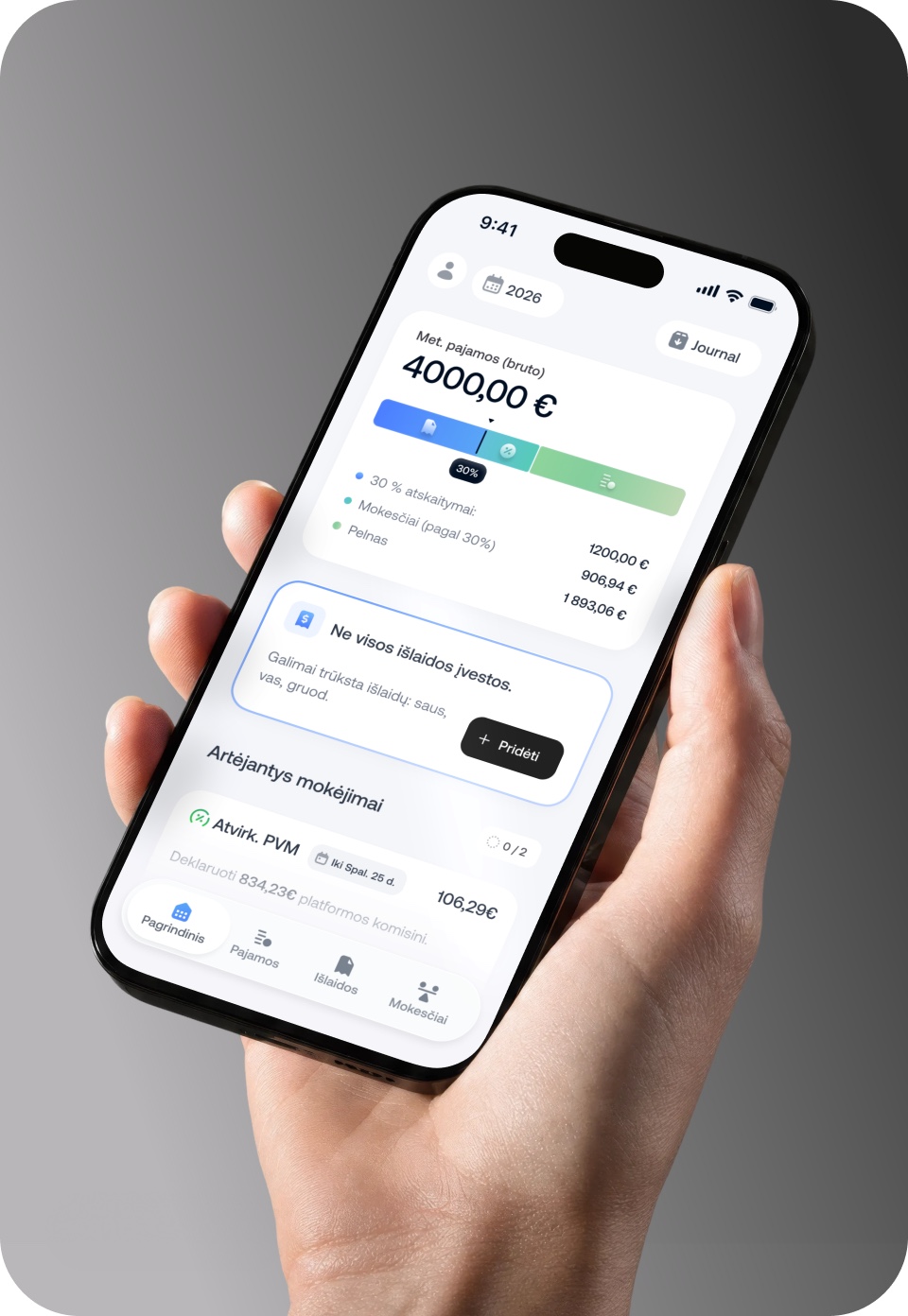
Partially, that discipline is how the next product began. Finhudas, a full accounting app for freelance drivers, is where we took the same patience and aimed it at a different real problem.
Next case study · Case 02
 Finhudas
Hi, I'm Lukas, founder of Ramojus.
I design and build products end to end.

 Book a call
Cal.com, 30-min call